
Breach Exposure in Your Product: 6 Patterns That Work
Your customers already ask the question. "Are any of our accounts in a breach?" A security platform, an MSP portal, an identity product, a helpdesk tool. Whichever one you build, someone types that into your support chat every month.
So you license the data and add a panel. And then the design questions start.
A red badge or a number? "Compromised" or "12 breaches"? Show the 2014 forum dump next to last month's stealer log, or hide it?
Show facts, not verdicts. Lead with a count and a date, list breaches by date with the data classes as chips, and put one plain sentence under each breach saying what it means. Then chart the trend rather than the total, mark what's new to the index and say new to whom, and write an empty state that promises nothing.
Six patterns. They're what we've seen hold up in the products that render our data, a few of them case studies on this site.
Each one comes with what to show, the API field it's built from, and the mistake we see most often. The fields belong to the partner API: one call per email address and one per onboarded domain, both documented in the Checking Breaches reference .
What you're designing with
The raw material first. A per-email lookup returns a list of breach names, or, with detailed=true, one object per breach with the same nine fields every time. Not one of them is a password.
| Field | What it holds | What it's for in a UI |
|---|---|---|
breach_id | the catalog name | the row label |
breached_date | when the breach happened, ISO 8601 (in our catalog every value lands on the first of a month) | the date column, and the old-or-recent call |
xposed_data | data classes as a semicolon list ("Email addresses;Passwords;Names") | chips |
password_risk | how the breached site stored passwords: plaintext, easytocrack, hardtocrack or unknown | the meaning line |
xposed_records | the breach's total size | context in the row, never the headline number |
xposure_desc | a one-paragraph description | the expanded row |
domain, logo, searchable | the breached site, its logo, whether it shows in public search | the row's icon and link |
The domain call adds the aggregate. breach_count, Yearly_Metrics (breaches per year), Domain_Summary (unique addresses exposed) and Top10_Breaches come every time. Seniority_Summary (C-suite, VP and director counts) fills in once enrichment has run, and details=true adds one row per address per breach.
That's the whole palette. Everything below is arrangement.
1. The status tile: a count and a date, never a verdict
The first thing a customer sees on the account or domain card, the onboarding summary, or the client overview in an MSP portal. It's where we most often see products go wrong, because the temptation is a colour.
Red means "compromised" and green means "safe", and neither is true. A domain with twelve breaches, all older than 2018 and none with passwords in them, isn't red. And nobody's ever safe, only unexposed as of today.
So the tile says what the data says:
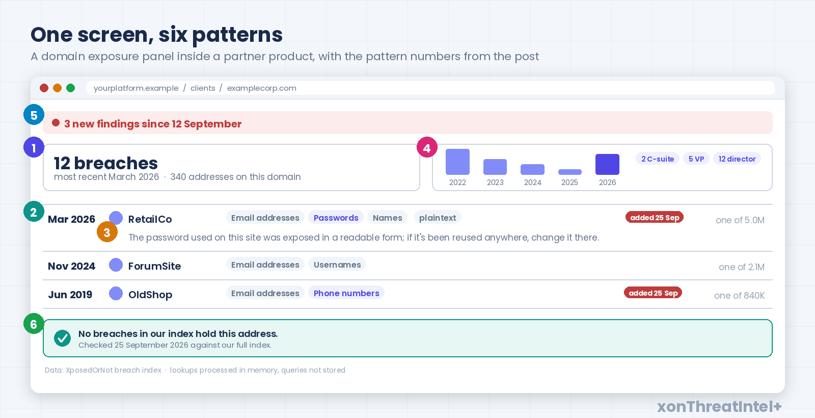
12 breaches · most recent March 2026 · 340 addresses on this domain
That's breach_count, the newest breached_date in Detailed_Breach_Info, and Domain_Summary. Nothing else. If you want a colour, drive it from a rule you can defend ("any breach in the last twelve months with passwords in it", say) and put the rule in the tooltip.
For a single user it's smaller still. "In 3 breaches, latest 2024" on the profile, built from the simple check (a list of names, so the count is its length) or from the detailed one if you want the date.
The mistake? A verdict word: "compromised", "at risk", "hacked". Each one is a claim about the person, and the data is a claim about a breach.
(One address in a nine-year-old forum breach is a fact. "At risk" is a guess.)
2. The list: dates first, chips second, size last
Under the tile, the breaches themselves. Sort by breached_date, newest first, and let the date be the first thing in the row. Not the name, not the logo.
Why the date? Because two thirds of our index (524 of 783 breaches, as of 25 September 2026) is more than five years old, and the median entry is nearly seven.
Lead with names and the customer reads "we've been hacked twelve times". Dates first, and it reads as history, which is what it is.
Then the data classes. xposed_data arrives as one semicolon-separated string; split it and render chips. Passwords, phone numbers and physical addresses earn a stronger chip than emails and usernames, since those are the three that change what a person should do next.
The record count goes last, and small. "One of 5.0M" is context. "5,000,000 RECORDS" in the row header is a headline, and it's about the breached site, not your customer.
| Column | Field | Treatment |
|---|---|---|
| Date | breached_date | first, month and year, the sort key |
| Breach | breach_id, logo, domain | name and icon, linked to the public catalog entry |
| What leaked | xposed_data | chips, stronger for passwords, phone, address |
| Storage | password_risk | a small label, only when passwords are in the chips |
| Size | xposed_records | last, muted, "one of 5.0M" |
| More | xposure_desc | behind a chevron, not inline |
One detail that pays for itself: every breach_id has its own page in the public catalog , at xposedornot.com/breach/<breach_id>. Link the row to it and your customer reads the same entry we did, and you never write a breach description yourself.
3. The meaning line: one sentence per breach, from two fields
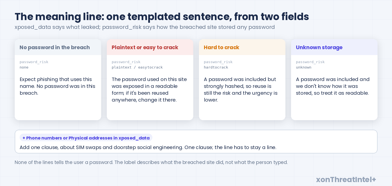
This is the pattern that turns a list into a product. Under each row, or in its expanded state, one sentence about what this breach means for the person, generated from xposed_data and password_risk.
Not AI-written: templated, from a table you control, because there are only a handful of real cases.
Emails and names, no passwords: "Expect phishing that uses this name. No password was in this breach." That's 267 of our 783 breaches as of 25 September 2026, a third of the index, and it's the case we see product teams skip when they write copy.
Passwords present, plaintext or easy to crack: "The password used on this site was exposed in a readable form; if it's been reused anywhere, change it there." Expect to render this one a lot. Look at our own index and you'll see why: 516 breaches carry passwords, and 289 of them were stored plaintext or with weak hashing (83 and 206 respectively, counted 25 September 2026).
Strong hashing gets a calmer line ("A password was included but strongly hashed; reuse is the remaining risk and the urgency is lower"), and the 74 with unknown storage get the honest version: "A password was included and we don't know how it was stored, so treat it as readable."
Phone numbers or a physical address in the chips add one clause, about SIM swaps and doorstep social engineering. One clause. The line has to stay a line.
(None of these sentences tell the user their password. We never see it, never store it, never return it; password_risk describes what the breached site did, not what the person typed. That's the boundary your customer's legal team will ask about first, so say so in your own UI too.)
The mistake here is the opposite of pattern 1: too little. A list of breach names with nothing under it makes the user do the analysis, and most won't. The reasoning behind the urgency buckets is in the MSSP first-48-hours runbook, if you want to show your product team where the lines come from.
4. The trend, not the total
For a domain view, resist the big number. Domain_Summary gives you unique addresses exposed, and a card that says "4,318 accounts exposed" ruins a CISO's morning without telling them anything they can act on.
Show Yearly_Metrics instead: breaches per year as a short bar strip, five or six years wide. The shape is the story. Bars all on the left mean old history; a tall bar this year means a live problem.
Beside it, the executive block. Seniority_Summary returns four keys (c_suite, vp, director, unknown) once enrichment has run, and three small chips ("2 C-suite · 5 VP · 12 director") are the part of the panel a buyer actually reads. Our own breach dashboard carries that block for the same reason.
Domain_Summary answers "how many people", because it counts unique addresses.
The details=true rows answer "how much work", because an address in four breaches is four rows, and the docs say to budget two to three rows per address. Mixing those up is an easy bug to ship in a first integration, which is why the docs spell the ratio out.
Enrichment is also asynchronous. A freshly onboarded domain shows zeros in the seniority block until enrichment finishes, and that runs after the breach build, not with it. Design the empty version of that block now, or it ships as "0 C-suite" on day one and looks broken.
5. New since you last looked
Open the panel twice and it has to show something different the second time. That's what since is for: the domain call takes it, an ISO 8601 instant, and returns only breaches that entered the index after it, plus an as_of watermark to hand back next time. One account-level webhook fires on the same event with per-domain counts, never an address, and it covers every domain on the account, including ones you onboard later.
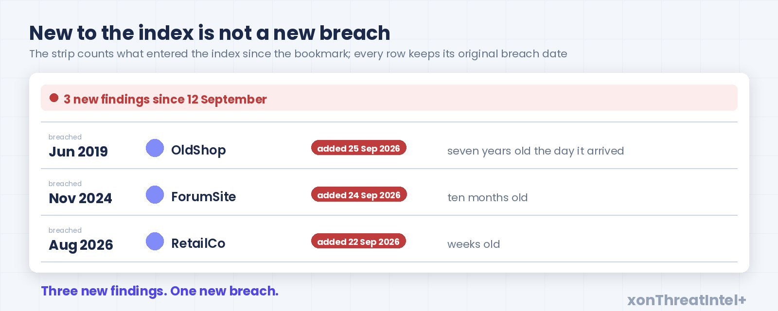
The strip at the top, then, reads "3 new findings since 12 September", with a dot, and the rows below wear a "new to the index" tag.
Now the copy trap, and it's a real one. New to our index and new in the world aren't the same thing. This year alone (to 25 September) 125 breaches entered our index, and thirty-five of them had happened more than a year before they got here.
Keep the real breached_date on the row. Put an "added 25 Sep" tag next to it, and let the reader see both.
A 2019 breach that surfaced today is a new finding. It isn't a new breach. Your customer will trust the panel more for the distinction.
Polling with the bookmark is gap-free by design (the watermark is stamped before the data's read), and an empty result is the normal answer rather than an error. Design for it: "Nothing new since 12 September" is a good day, and the UI should look pleased about it.
Where the webhook goes after that, into a queue, a ticket or a chat channel, is a post of its own.
6. The empty state, and the footer that earns trust
In our experience a large share of lookups come back empty. Write that screen first, because it's the one your users will meet most, and it's where "You're safe!" sneaks in.
No breaches in our index hold this address. Checked 25 September 2026 against 783 breaches.
Nothing in that line promises anything: a date and a denominator are all an empty state can honestly carry.
Nobody's index is the whole world, ours included. A customer who was told "safe" and then reads about their own breach in the news will remember who said it.
The footer under any exposure panel does two jobs. Attribution: where the data comes from and how big the index is, with the as-of date. And the privacy line: lookups are processed in memory, and the queries your product sends aren't logged or stored.
Both are questions your customer's security team will ask before they trust the panel. Answer them in the UI before they have to email.
(A live count in the footer needs a live number. Pull it from the public catalog endpoint at render time rather than baking "11.6 billion" into a string that's wrong by Christmas.)
The six on one page
| Pattern | Built from | Show | Never |
|---|---|---|---|
| 1. Status tile | breach_count, newest breached_date, Domain_Summary | a count, a date, an address count | a verdict word |
| 2. The list | breached_date, xposed_data, password_risk, xposed_records | date first, chips, size last | the record count as the headline |
| 3. Meaning line | xposed_data with password_risk | one templated sentence per breach | the password, or a guess about the person |
| 4. Trend | Yearly_Metrics, Seniority_Summary | bars per year, executive chips | one big total |
| 5. New since | since, as_of, the webhook | "3 new since <date>", added date beside breach date | "new" without saying new to whom |
| 6. Empty state | the response you didn't get | date, denominator, attribution, privacy line | "you're safe" |
Three things not to build
A password box. Nothing in the partner API returns or accepts a password, so don't design a field that implies it does. The storage label is as close as the panel gets, on purpose.
A "dark web score". One number from 0 to 100 that blends counts, ages and data classes.
Customers ask for it, and the catalog explains why it disappoints: 524 of our 783 breaches are more than five years old (as of 25 September 2026), so a blended score spends most of its life moving because of history. Someone then has to explain why a 2012 breach nudged it last Tuesday. The six patterns above are the score, unbundled.
Detection language. "We detected this breach" is true only of whoever found it. The honest verb for your panel is "reached the index" or "added", and the honest date is the breached_date the row already carries.
Getting it into your product
The data side of this is small: two endpoints, one header, JSON back, with Python and Node SDKs if you'd rather not write the HTTP yourself.
Partner access is xonThreatIntel+ for platforms: public pricing, one 30-minute call to sign the partner agreement, then credentials and docs the same day. The per-email check on its own is xonAPI+ from $9 a month.
A sensible first sprint? Run the domain call on a domain you already know, put the status tile and the dated list on a branch, and show both to one customer before you build the other four.
The quickstart walks the first call end to end with real responses. Build, license or white-label is the longer version of why the pipeline stays on our side of the wall.
The design side is yours, which is the point: the breach-health picture inside your product, in your brand, with your empty state. We make sure the fields underneath it don't lie.
Want to see the data on a domain you know before you draw anything? Put it through the exposure check; it takes a domain name and nothing else.
Quick answers
How should a product show data breach exposure to users?
As facts with dates: a count of breaches and the most recent one, a list sorted by breach date with the exposed data classes as chips, and one plain sentence per breach saying what it means. Avoid verdict words like "compromised" or "safe", because the data describes breaches, not people. Give the empty state a date and a denominator.
What fields does a breach API return for a UI?
Ours returns, per breach, a name, the breach date, the exposed data classes, how the breached site stored passwords (plaintext, easy to crack, hard to crack or unknown), the record count, a description and the breached site's domain. Per domain it adds the breach count, breaches per year, unique addresses exposed, a top-ten list and an executive split, and never a password.
Should a breach exposure panel show a risk score?
In our experience, no: a blended 0-to-100 score hides the two things a user needs, how old the breach is and whether a readable password was in it. And it moves for reasons you'll have to explain. Show the count, the date, the data classes and the storage label instead.
How do you show new breach findings without overstating them?
Label them as new to the index, not as new breaches, and keep the original breach date beside the added date. Of the 125 breaches we added in 2026 up to 25 September, 35 were more than a year old when they arrived, so "new" has to say new to whom.
Where the numbers came from
- Catalog size (783 breaches, 11,621,497,431 records), password-exposing entries (516, and 267 without), storage labels among them (83 plaintext, 206 easy to crack, 153 hard to crack, 74 unknown), age (524 of 783 older than five years, median about 6.8 years) and the 2026 additions (125, of which 35 more than a year old on arrival): api.xposedornot.com/v1/breaches , fields breachedDate, addedDate, exposedData, passwordRisk and exposedRecords, pulled 25 September 2026. Age is the pull date minus breachedDate, and every breachedDate in the catalog sits on the first of a month. Records, not people.
- Per-email response fields, the domain summary fields, unique addresses versus detail rows, the two-to-three-rows budget,
sinceandas_of, and the enrichment timing: Checking Breaches, partner API . Webhook notifications carrying per-domain counts and never email-level data: partner webhook guide . Both read 25 September 2026. - Nine fields per breach object, with null present rather than missing: the xonAPI+ quickstart, which executed the call on 20 August 2026.
- In-memory processing with no logging of the queries a platform sends, the Python and Node SDKs, and the 30-minute signing call followed by same-day self-serve credentials: xonThreatIntel+ for platforms, read 25 September 2026. The account-level webhook covering domains onboarded later: partner webhook guide , same day.
- The tile and empty-state examples are made up: 12 breaches, 340 addresses and the dates match no customer and no catalog entry.
- Earlier posts this one leans on: Getting Breach Data Into Your Product: Build, License, or White-Label, Getting started with xonAPI+, Client Domain Breached? The MSSP's First 48 Hours, Step by Step, Alert Routing That Doesn't Wake You at 3am.